How To Plot A Confusion Matrix In Python
In this post I will demonstrate how to plot the Confusion Matrix. I will be using the confusion martrix from the Scikit-Learn library (sklearn.metrics) and Matplotlib for displaying the results in a more intuitive visual format.
The documentation for Confusion Matrix is pretty good, but I struggled to find a quick way to add labels and visualize the output into a 2x2 table.
For a good introductory read on confusion matrix check out this great post:
http://www.dataschool.io/simple-guide-to-confusion-matrix-terminology
This is a mockup of the look I am trying to achieve:
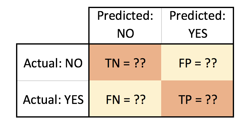
- TN = True Negative
- FN = False Negative
- FP = False Positive
- TP = True Positive
Let’s go through a quick Logistic Regression example using Scikit-Learn. For data I will use the popular Iris dataset (to read more about it reference https://en.wikipedia.org/wiki/Iris_flower_data_set).
We will use the confusion matrix to evaluate the accuracy of the classification and plot it using matplotlib:
import numpy as np
import pandas as pd
import matplotlib.pyplot as plt

from sklearn import datasets
data = datasets.load_iris()

df = pd.DataFrame(data.data, columns=data.feature_names)
df['Target'] = pd.DataFrame(data.target)
df.head()
>>> output
show first 5 rows | sepal length (cm) | sepal width (cm) | petal length (cm) | petal width (cm) | Target | |
|---|---|---|---|---|---|
| 5.1 | 3.5 | 1.4 | 0.2 | 0 | |
| 4.9 | 3.0 | 1.4 | 0.2 | 0 | |
| 4.7 | 3.2 | 1.3 | 0.2 | 0 | |
| 4.6 | 3.1 | 1.5 | 0.2 | 0 | |
| 5.0 | 3.6 | 1.4 | 0.2 | 0 |
We can examine our data quickly using Pandas correlation function to pick a suitable feature for our logistic regression. We will use the default pearson method.
corr = df.corr()
print(corr.Target)
>>> output
sepal length (cm) 0.782561
sepal width (cm) -0.419446
petal length (cm) 0.949043
petal width (cm) 0.956464
Target 1.000000
Name: Target, dtype: float64So, let’s pick the two with highest potential: Petal Width (cm) and Petal Lengthh (cm) as our (X) independent variables. For our Target/dependent variable (Y) we can pick the Versicolor class. The Target class actually has three choices, to simplify our task and narrow it down to a binary classifier I will pick Versicolor to narrow our classification classes to (0 or 1): either it is versicolor (1) or it is Not versicolor (0).
print(data.target_names) >>> output
array(['setosa', 'versicolor', 'virginica'],
dtype='<U10')Let’s now create our X and Y:
x = df.iloc[0: ,3].reshape(-1,1)
y = (data.target == 1).astype(np.int) # we are picking Versicolor to be 1 and all other classes will be 0
We will split our data into a test and train sets, then start building our Logistic Regression model. We will use an 80/20 split.
from sklearn.cross_validation import train_test_split

x_train, x_test, y_train, y_test = train_test_split(x,y, test_size = 0.20, random_state = 0)
Before we create our classifier, we will need to normalize the data (feature scaling) using the utility function StandardScalar part of Scikit-Learn preprocessing package.
from sklearn.preprocessing import StandardScaler
sc_x = StandardScaler()
x_train = sc_x.fit_transform(x_train)
x_test = sc_x.transform(x_test)
Now we are ready to build our Logistic Classifier:
from sklearn.linear_model import LogisticRegression
logit = LogisticRegression(random_state= 0)
logit.fit(x_train, y_train)

y_predicted = logit.predict(x_test)
Now, let’s evaluate our classifier with the confusion matrix:
from sklearn.metrics import confusion_matrix

cm = confusion_matrix(y_test, y_predicted)
print(cm)
>>> output
[[15 2]
[ 13 0]]Visually the above doesn’t easily convey how is our classifier performing, but we mainly focus on the top right and bottom left (these are the errors or misclassifications).
The confusion matrix tells us we a have total of 15 (13 + 2) misclassified data out of the 30 test points (in terms of: Versicolor, or Not Versicolor). A better way to visualize this can be accomplished with the code below:
plt.clf()
plt.imshow(cm, interpolation='nearest', cmap=plt.cm.Wistia)
classNames = ['Negative','Positive']
plt.title('Versicolor or Not Versicolor Confusion Matrix - Test Data')
plt.ylabel('True label')
plt.xlabel('Predicted label')
tick_marks = np.arange(len(classNames))
plt.xticks(tick_marks, classNames, rotation=45)
plt.yticks(tick_marks, classNames)
s = [['TN','FP'], ['FN', 'TP']]
for i in range(2):
    for j in range(2):
        plt.text(j,i, str(s[i][j])+" = "+str(cm[i][j]))
plt.show()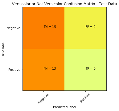
To plot and display the decision boundary that separates the two classes (Versicolor or Not Versicolor ):
from matplotlib.colors import ListedColormap
plt.clf()
X_set, y_set = x_test, y_test
X1, X2 = np.meshgrid(np.arange(start = X_set[:, 0].min() - 1, stop = X_set[:, 0].max() + 1, step = 0.01),
                     np.arange(start = X_set[:, 1].min() - 1, stop = X_set[:, 1].max() + 1, step = 0.01))
plt.contourf(X1, X2, logit.predict(np.array([X1.ravel(), X2.ravel()]).T).reshape(X1.shape),
             alpha = 0.75, cmap = ListedColormap(('red', 'green')))
plt.xlim(X1.min(), X1.max())
plt.ylim(X2.min(), X2.max())
for i, j in enumerate(np.unique(y_set)):
    plt.scatter(X_set[y_set == j, 0], X_set[y_set == j, 1],
                c = ListedColormap(('red', 'green'))(i), label = j)
plt.title('Logistic Regression (Test set)')
plt.xlabel('Petal Size')
plt.ylabel('Versicolor')
plt.legend()
plt.show()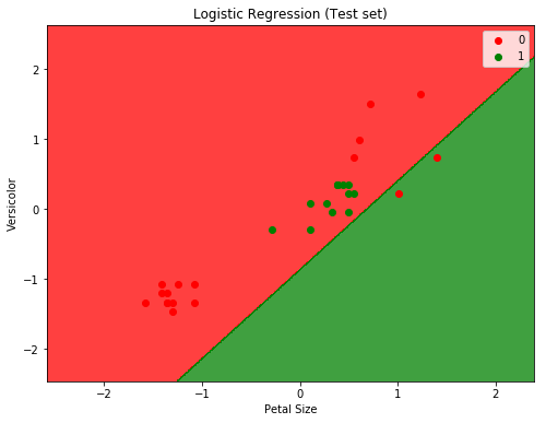
Will from the two plots we can easily see that the classifier is not doing a good job. And before digging into why (which will be another post on how to determine if data is linearly separable or not), we can assume that it’s because the data is not linearly separable (for the IRIS dataset in fact only setosa class is linearly separable).
We can try another non-linear classifier, in this case we can use SVM with a Gaussian RBF Kernel:
from sklearn.svm import SVC

svm = SVC(kernel='rbf', random_state=0)
svm.fit(x_train, y_train)

predicted = svm.predict(x_test)

cm = confusion_matrix(y_test, predicted)
plt.clf()
plt.imshow(cm, interpolation='nearest', cmap=plt.cm.Wistia)
classNames = ['Negative','Positive']
plt.title('SVM RBF Kernel Confusion Matrix - Test Data')
plt.ylabel('True label')
plt.xlabel('Predicted label')
tick_marks = np.arange(len(classNames))
plt.xticks(tick_marks, classNames, rotation=45)
plt.yticks(tick_marks, classNames)
s = [['TN','FP'], ['FN', 'TP']]

for i in range(2):
    for j in range(2):
        plt.text(j,i, str(s[i][j])+" = "+str(cm[i][j]))
plt.show()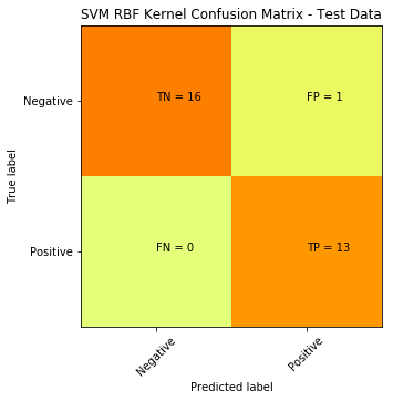
Here is the plot to show the decision boundary
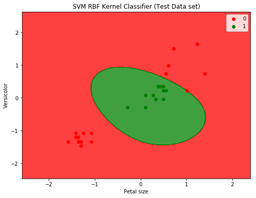
SVM with RBF Kernel produced a significant improvement: down from 15 misclassifications to only 1.
Hope this helps.
note: code was written using Jupyter Notebook